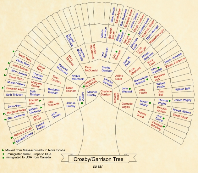
Sometimes there is nothing more sobering than seeing a heap of data presented in a visual way. This was the case when I completed a six generation family tree.

Before this fan version of my tree I was feeling pretty good about my success. I have traced many ancestors in the the 1600s, 1700s and some even further back. I knew there were some branches lacking, but I did not realize the size of some of the bare spots in the tree. The largest void occurs along my paternal grandmother’s line. All those darn Scottish names in Nova Scotia make it near impossible, so far, to move backwards with certainty. I have found some possible branches, but can’t confirm the information. I would much rather have an incomplete tree, than an inaccurate tree.
At any rate, I like this visual format. Its not fancy, but it is informative. I will be hanging a copy next to my computer so it will remind me that there is still a lot of work to be done on the first six generations.
Blank copies of the form can be found at http://www.melickprofessionalgenealogists.com/free-family-tree-template/


Love this chart view. Best I have seen!
How did you print the names to it?
Wish it was an optionat FTM.2012
Penny
I imported the chart into my graphics program (Corel Xara) and was about to rotate the text to any angle.
I do like how clear and simple the view is.